
COGA Election Coverage
Election Coverage & Resources
National Council for Geographic Education's journal, The Geography Teacher, offers "Support for Teachers During a Challenging Electoral Season."
"Armed with details about the current situation as well as past electoral patterns and demographic shifts, teachers will have tools to guide the conversations in their classrooms so that their students are able to make sense of the electoral process in the United States, to consider this election in light of past elections, and to imagine factors influencing how elections going forward will be similar or different." (Editor's Notebook, Volume 13, Issue 3, Page 91)
In light of the importance of this topic, publisher Taylor & Francis has provided free access to the current issue of "The Geography Teacher" lasting through the election season. You will find tips for teaching the election in elementary and secondary classrooms, as well as background on the Electoral College, geographic polarization of American voters, and spatial electoral realignment. Ideas for using data and maps are also included. Colorado Springs high school teacher Anton Schulzki and Broomfield-based Environmental Systems Research Institute (Esri) Education Manager Joseph Kerski have articles in the issue.
To Teach or Not to Teach, That is the Question
Start with Election 2016 Toolkit by Teaching Tolerance
Other helpful tips and articles -
- Road to the White House: Provides explanations of the various aspects of the election process through video clips, discussion questions, handouts and culminating activities. C-SPAN
- Election Central: Engage students;on the process and history of elections by utilizing this hub of resources to help turn election news coverage into learning opportunities. PBS Election
- 6 Strategies: Teacher suggestions on how to discuss the coming election. Smart Brief
- Navigation Class Debate: How teachers can teach the political process during a polarizing election year. Chalkbeat
- Tackle the Election: Discover what some schools are doing to address the election and how their classes are taking part in the "vote." Ash Park
- Fostering Civil Discourses: A Guide for Classroom Conversations, creating a safe and reflective space where students can listen and learn from each other's opinions and experiences. Teaching Tolerance
- Ideas for fostering respectful and productive discussions, both online and off: Talking Across Divides: 10 Ways to Encourage Civil Classroom Conversation On Difficult Issues by Katherine Schulman
- Utilizing Primary Sources to Help Teach the Election Presidential Election of 1872: Similar Themes to Today: Presidential elections are often filled with interesting candidates and sometimes party conflicts. The presidential election of 1872 was no different. This election included numerous presidential nominees, one of which was a woman and another was nominated by two different parties. Check Out this PDF for helpful primary sources. Courtesy of the Colorado Historic Newspapers Collection.
- Children ages 10 to 14 have been facing some unusual challenges while covering the primary campaigns and general election for the book publisher Scholastic: The PG-13 Reporters Covering an R-Rated Election by Alexandra Alter
Articles
- Eight Ways Communities Can Make Elections Smarter, Matt Artz, Esri Insider, February 4, 2016
- The Electoral College: 538 votes determine 'The Leader of the free world," Adam Lenhardt, National Geographic Society
- There's more than one way to map an election, Greg Miller, National Geographic, October 16, 2016
- Boulder 5th Graders Find Hope, Yes Hope, In The 2016 Election, Jenny Brundin, Colorado Public Radio, November 2, 2016
Maps
Presidential Election 2016
- 2016 Primary Election Results, The Des Moines Register
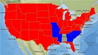
| One of the best ways to understand the current election may be by exploring what happened in the previous one. The Standford 2008 Precinct Map shows who won each precinct throughout the nation, with areas where the vote was close highlighted in white. You can use this to show a comparison with how the precincts are expected to vote this term. |
Stanford 2008 Precinct Map |
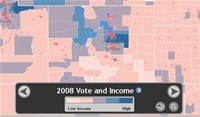
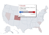
| Another great tool to understanding the last election, also produced by Stanford, is the Stanford Election Atlas. This tool allows you to compare election results to such factors as income, race, and even the potential number of votes per square mile. |
Stanford Election Atlas |
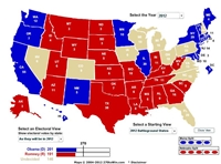
| For a little more historical perspective, you can access ESRI's "Historical Electoral Votes By State" online interface. This great online GIS allows you to see how different states voted in each election back to 1956. |
Electoral Votes by State: Historical |
| The road to the elections has been a long one - and the way that the candidates are decided are through the Primary and Caucas system. ESRI has the entire story of primaries with its "Election Year Primaries" storymap. This tool shows not only the dates and results of each primary across the nation, but also includes demographics, political attitudes, and more. |
Election Year Primaries Storymap |
| Another great resource from ESRI is the "US 2012 Presidential Election Map." This online web GIS allows you to explore the 2012 US Presidential election via state demographics from 2010, plus election data from previous years. For more about the tool, read the ESRI blog post on its creation and use. |
US 2012 Presidential Election Map |
| Wondering what states are considered "battleground" states? Interested in tracking the election as it happens? 270towin.com has all this information, including analysis of probably election outcomes and a tool to share your prediction of the election geovisually. |
270towin.com |
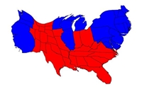
| Cartograms are maps where some thematic mapping variable is substituted for distance on the map - effectively making the sizes on the map represent something other than the actual distance between two points. In this case, cartograms were created for the 2004 and 2008 elections that size areas in relation to factors such as electoral votes or votes by county. |
Election Cartograms |
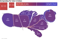
| For more interesting cartograms - including a great cartogram that morphs the map based upon ad spending per state - check out this site from National Public Radio. |
Cartogram by campaign spending |
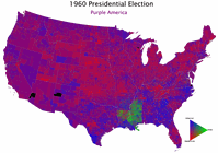
| "Purple America" is a discussion about how America is no longer red vs. blue, but increasingly "purple," in the middle. The site includes some great geovisualizations of the 2004 election and can help to understanding voting preferences in the past, which lead toward the future. |
Purple America |
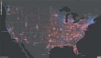
| Voting America encourages users to think about political history by allowing two types of comparison. Animations of a single type of map - say, measuring the winner of presidential elections at the county level - allow for comparisons across time. Users can also explore a single election by looking at patterns across a number of variables, including the percentage of votes won by parties, the winner of a given district, or the distribution of votes across the United States. |
Voting America |
| David Leip's Atlas of Presidential Elections - The Atlas is a free internet resource providing results of U.S. Presidential Elections to the world community. Data is collected from many official sources and presented here in one convenient location. Site membership is now available for those individuals or groups who desire greater levels of detail with regard to U.S. Presidential Elections. | 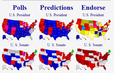 |

Articles
- In G.O.P. Nomination Race, Geography Has Been Destiny, Nate Silver, The New York Times, March 10, 2012
General
Geography of Elections
- Elections Workshop Assessment (MS Word format)
- Elections Workshop Regions (MS PowerPoint format)
- Elections Workshop Resources (MS Word format)
- Elections Workshop Rubric (MS Word format)
Presidential Election 2012
- In G.O.P. Nomination Race, Geography Has Been Destiny, Nate Silver, The New York Times, March 10, 2012
- Primary Calendar, Mapstories, Esri, Inc.