Atlases, Maps & Collections
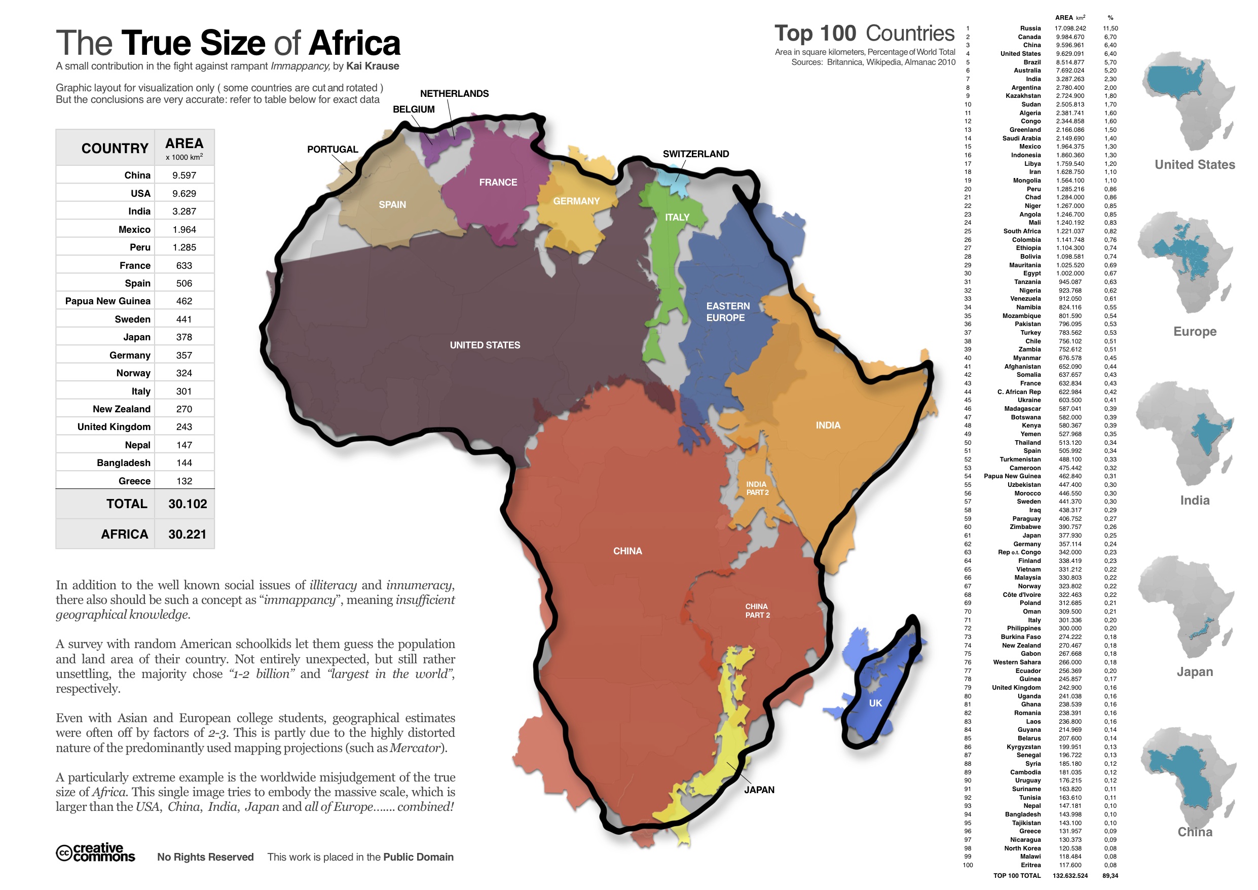
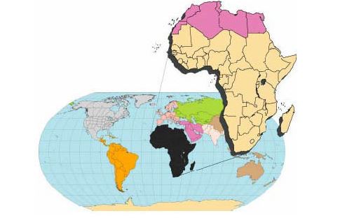
The True Size of Africa

Created Kai Krause, this map shows how easily various countries of the world would fit into the continent of Africa. Many students misperceive the size of Africa due to distortions brought on by projecting a spherical earth onto a two dimensional map. This map helps to challenge those perceptions and expose students to a different way of looking at our planet earth. Africa is larger than the USA, China, India, Japan, and all of Europe, combined!
Animated Maps of Military History
From the History Animated, presents timelines for some of the most important battles in history, animated with sound to help bring the lesson to life. Wars covered include the Civil War, the Revolutionary War, and WWII from both the Atlantic and Pacific sides of the war. These animations are available for free online, but can also be downloaded by teachers in exchange for a tax-deductible donation.
China, Selden Map
In 1712, the antiquary and diarist Thomas Hearne was appointed Keeper of the Anatomy School, now the main reference area in the Lower Reading Room of the Bodleian Library. In 1721, he wrote a list of its contents, among which was "A very odd map of China. Very large, & taken from Mr. Selden's". This is what we now know as the Selden Map of China. It was left to us by the London lawyer John Selden in 1659, and has been famous as an interesting curiosity ever since. But only in January 2008, when the visiting scholar Robert Batchelor noticed the very faint lines indicating trade routes and compass bearings from the port of Quanzhou to all parts of East Asia and beyond, was the immense significance of the map realized.
Bizarre Map Challenge 2010
"Bizarre", in this competition, refers to maps that are strikingly out of the ordinary. Though all maps must use real-world data, successful entries might employ unusual techniques, illustrate bizarre topics, or exhibit striking patterns. This competition will not accept imaginary maps, hand-drawn maps, or video game maps.
Countries Rearranged by Population
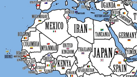
What if the world were rearranged so that the inhabitants of the country with the largest population would move to the country with the largest area? And the second-largest population would migrate to the second-largest country, and so on?
The result would be this disconcerting, disorienting map.
Degree Confluence Project Composite World Map
The goal of the project is to visit each of the latitude and longitude integer degree intersections in the world, and to take pictures at each location. The pictures, and stories about the visits, will then be posted here. The project is an organized sampling of the world. There is a confluence within 49 miles (79 km) of you if you're on the surface of Earth. We've discounted confluences in the oceans and some near the poles, but there are still 10,117 to be found.
Top 10 Unusual Maps of 2011
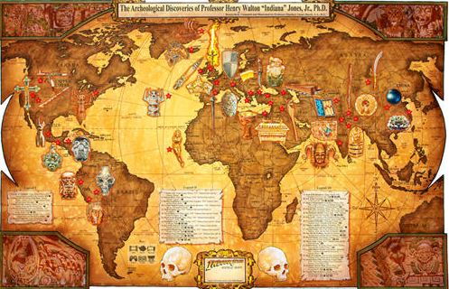
from Indiana Jones to cartoon maps, Directions Magazine presents their top picks for unusual and interesting maps of 2011.
- Climate Change Vulnerability Index 2012
- Interactive Map: Texas Cities at Risk of Running Out of Water
- UCL Hand-drawn map of London
- Civil War Trust Maps
- And many more!
The Greatest Paper Map Ever
So what makes this map different from the Rand McNally version you can buy at a bookstore? David Imus worked alone on his map seven days a week for two full years. Nearly 6,000 hours in total. It would be prohibitively expensive just to outsource that much work. But Imus-a 35-year veteran of cartography who's designed every kind of map for every kind of client-did it all by himself. He used a computer (not a pencil and paper), but absolutely nothing was left to computer-assisted happenstance. Imus spent eons tweaking label positions. Slaving over font types, kerning, letter thicknesses. Scrutinizing levels of blackness. Read the article to find out more about why this map won the award!
Ethnographic Maps of the 19th Century
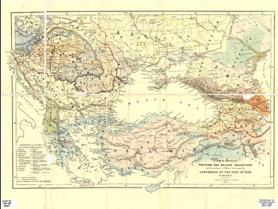
This Web page provides access to some of the 19th-century ethnographic maps that are held at the University of Chicago Library's Map Collection. Most of these maps show the distribution of particular ethnic groups or languages. A few show the geography of other aspects of culture. The majority of the maps concentrate either on parts of the colonial world in which the ethnic distribution was only coming to be known by Western scholars--or else on one of those regions of Europe or the Middle East where the geography of ethnicity conflicted with political boundaries. There are also two urban maps. The maps reflect the period in which they were produced. They show the world as it seemed to their compilers. Several of the names that appear on the maps (e.g., Kaffir and Ruthenian) are now little used. The racial classifications and Leo Frobenius's Kulturkreise now seem old-fashioned. And, of course, some of the ethnic boundaries (for example, those between Germans and Poles and between Armenians and Turks) have changed radically. Most of these maps are "choropleth" maps: they show ethnicity and language in solid colors.
Floating Sheep
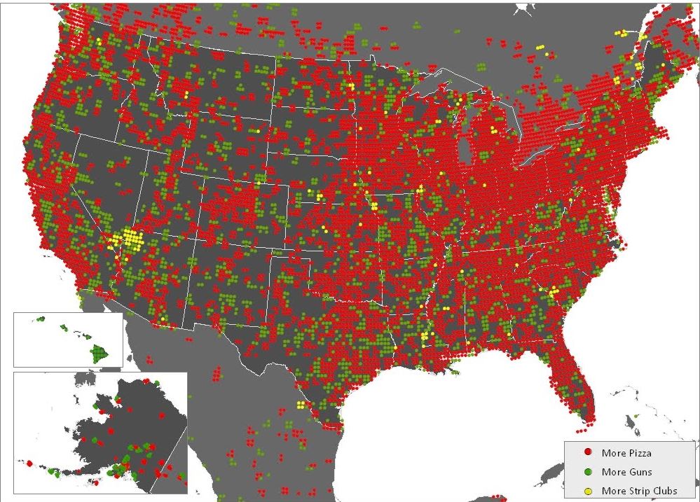
There is an increasing amount of data on the Internet that is geo-coded to a particular spot on the earth. This has huge implications for how we interact with our surroundings and each other. This site is dedicated to mapping and analyzing user generated geocoded data. The results provide one glimpse of what internet users (in the aggregate) think about particular places. Where are people posting placemarks about swine flu? Which places are considered to be "fun" by the collective intelligence of the Internet users? With topics ranging from "The Geography of Hate" to "The Beer Belly of America," Floating Sheep turns a sly eye at geography and social media, bringing the two together in interesting and innovative ways.
Benjamin Franklin Map of the Gulf Stream
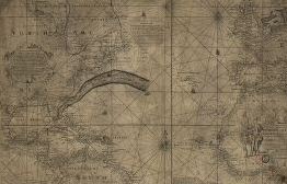
A historic map created by Benjamin Franklin and Timothy Folger in 1768 charting the Gulf Stream. From the Library of Congress. "A new and exact chart of Mr. E. Wrights projection, rut. Mercators chart, con. ye sea coast of Europe, Africa & America, from ye Isles of Orkney to Cape Bona Esperance & Hudsons Bay to ye straits of Magellan, according to ye observations of Capt. E. Halley, fellow of ye R.S. / to the Rt. Honble., ye Principle Officers & Commissioners of His Majesties Navy ; this chart is most humbly dedicated and presented by their most obedient faithful servants John Mount & Th. Page ; H. Moll fecit."
Geologic Map of Africa
Here in the U.S. we may be familiar with the geology of our own region, but not be as much so with some of the other continents. This map from the USGS shows the geology of the continent of Africa, including mineral deposits and oil and natural gas fields. This map can be useful for exploring geologic principles as they apply across different continents.
Global Flood Map
What would happen to the world if the oceans rose 2 inches? 10 inches? 24 inches?? Use the interactive map by entering in any number of inches - the map will show what areas would be flooded or at risk and the left side bar will display the number of people displaced. Click on individual points for current elevation, elevation after sea level rise, and the number and percentage of people losing homes. Global Flood Map uses NASA satellite data to show the areas of the world under water and at risk for flooding if ocean levels rise.
Strange Maps Blog
Frank Jacobs loves maps, but finds most atlases too predictable. He collects and comments on all kinds of intriguing maps-real, fictional, and what-if ones-and has been writing the Strange Maps blog since 2006, first on WordPress and now for Big Think. His map "US States Renamed For Countries With Similar GDPs" has been viewed more than 587,000 times. An anthology of maps from this blog was published by Penguin in 2009 and can be purchased from Amazon and Barnes & Noble. by Frank Jacobs
The Atlas of Colorado
Includes 75 pages of maps and graphs created from data compiled by a variety of sources and covering both physical and human landscapes, 67 photographic images displaying scenes from throughout the state, and 2 tables of population and agricultural data.
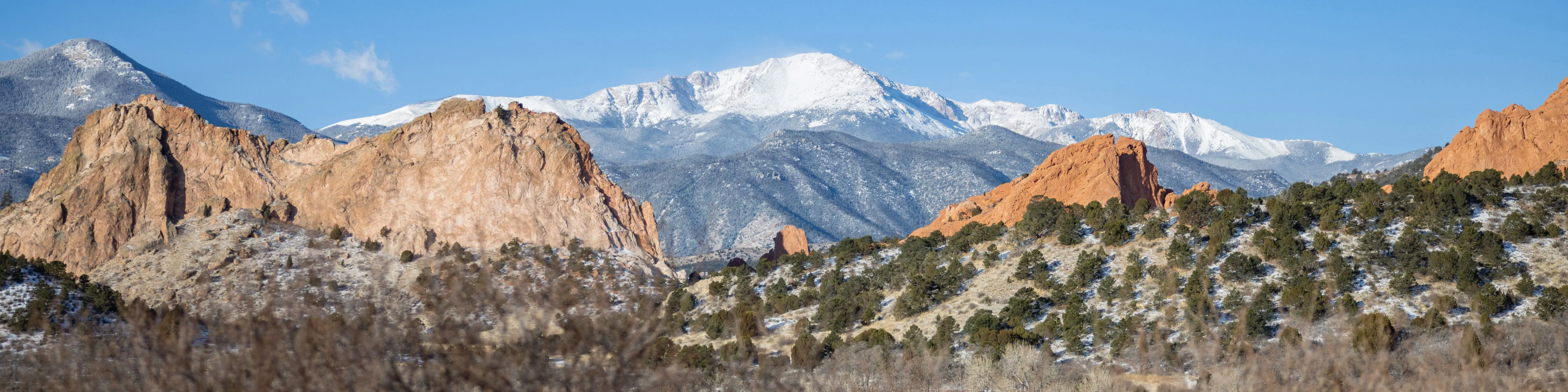
Colorado's Geography
A set of activities for elementary- and middle-grades students to explore Colorado's historical geography. The project includes standards-based geography content and geographic information science (GIS) mapping technology. Units cover Colorado's regions and environment and historical changes in its population, transportation, and economic resources.
GeoCommons
GeoCommons is the public community of GeoIQ users who are building an open repository of data and maps for the world. The GeoIQ platform includes a large number of features that empower you to easily access, visualize and analyze your data.
The National Atlas
Houses maps on a variety of topics, including climate, environment, geology, government, and history. One of the best aspects of this site is the collection of maps ready to printed and used in the classroom. If you're looking for a map on just about any topic, this is the place to go!
Sea Level Rise Maps
A multi-year project by the US Environmental Protection Agency's Global Programs Division developed regional, state, and county-scale elevation maps to illustrate vulnerability to sea level rise, using existing data. EPA published the peer-reviewed technical documentation, but not the maps themselves. But you can get them here.